
最近參加了機器學習 百日馬拉松的活動,單純記錄下這100天python機器學習中每日覺得最有收穫的地方,如果有想參加這活動的朋友,真心推薦參加!
此次機器學習-百日馬拉松的相關代碼放置於:https://github.com/hsuanchi/ML-100-days
機器學習相關延伸閱讀:
目錄
ㄧ. 損失函數 MSE & MAE:
機器學習大部分的算法都有希望最佳化損失函數 (損失函數 = y表示實際值 – ŷ表示預測值)
1.回歸常用的損失函數:
* 均方誤差(Mean square error,MSE)
* 平均絕對值誤差(Mean absolute error,MAE)
2.分類問題常用的損失函數:
* 交叉熵(cross-entropy)
二. iloc & loc:
iloc[列,欄] 應用於數字
df.iloc[行index,列index]
loc[列,欄] 應用於文字
df.loc[行index,[column name]]
三. Random數值:
|
1 2 |
np.random.randint(low=10000, high=50000, size=4) >>> array([33547, 23670, 31387, 44090]) |
# array轉成dataframe
|
1 2 |
df_np = np.random.randint(low=10000, high=50000, size=(2,4)) df = pd.DataFrame(df_np) |
# dataframe轉成array
|
1 |
df=df.values |
四. One Hot Encoder:
分類器不好處理屬性資料的問題,所以需要One Hot Encoder將特徵值轉用數字表示,機器學習效率會高很多
參考文件:Label Encoder vs. One Hot Encoder in Machine Learning
|
1 |
pandas.get_dummies(data, columns=None) |
五. 正規化(Normalization) :
|
1 2 |
def normalize_value(x): return 2 * (( x - np.min(x) ) / ( np.max(x) - np.min(x) ) - 0.5) |
六. 變數離散化:
- 等寬劃分:按照相同寬度將資料分成幾等份。缺點是受到異常值的影響比較⼤。
- 等頻劃分:將資料分成幾等份,每等份資料裡⾯的個數是⼀樣的。
- 聚類劃分:使⽤聚類演算法將資料聚成幾類,每⼀個類為⼀個劃分。
|
1 2 3 4 5 6 7 8 9 10 11 12 |
# 等寬劃分 ages["equal_width_age"] = pd.cut(ages["age"], 4) ages["equal_width_age"].value_counts() # 等頻劃分 ages["equal_freq_age"] = pd.qcut(ages["age"], 4) ages["equal_freq_age"].value_counts() # 自定義劃分 bin = [10, 20, 30, 50, 100] ages["customized_age_grp"] = pd.cut(ages["age"], bin) ages["customized_age_grp"].value_counts() |
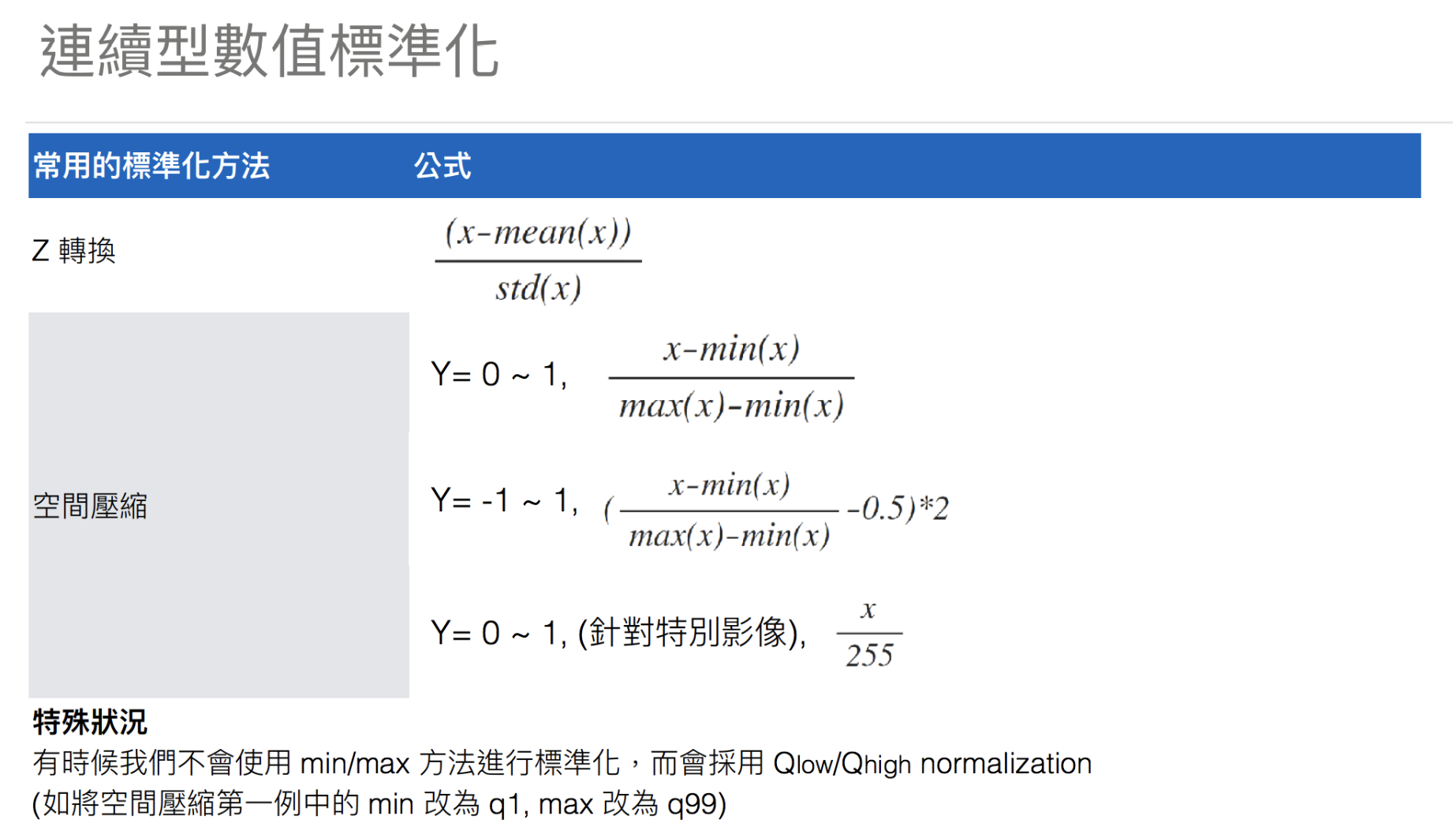
七. 經驗累積分佈函:
可以看到AMT_REQ_CREDIT_BUREAU_YEAR 這個欄位的最大值離平均與中位數很遠,但在plt.hist實無法顯示數量較少的區間。所以使用ECDF(經驗累積分佈函)來顯示,可以很明顯地觀察出10~25的分佈情況。
延伸閱讀:探索資料-ECDF
|
1 2 3 4 5 6 7 8 9 10 11 12 |
def ecdf(data): n = len(data) x = np.sort(data) y = np.arange(1, n+1) / n return x, y # 繪製 Empirical Cumulative Density Plot (ECDF) x, y = ecdf(df['AMT_REQ_CREDIT_BUREAU_YEAR']) plt.plot(x, y) plt.xlabel('Value') plt.ylabel('ECDF') plt.show() |
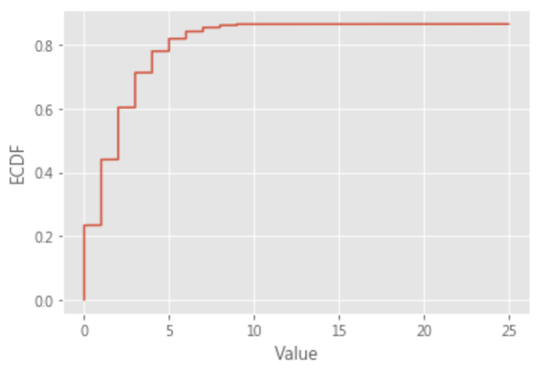
ECDF取log
- 縮小數據的絕對值,方便計算
- 取log後,可以將乘法轉換為加法計算
- 取log可以將大於中位數的值按一定比例縮小,讓數據更趨近於正態
 python ml 100days – ecdf+log
 python ml 100days – ecdf+log
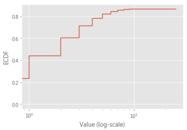
八. 核密度估计(kernel density estimation):
- KDE可以模擬真實的概率分佈曲線,並得到相對直方圖平滑而漂亮的結果
- 在數據點處為波峰
- 曲線下方面積為1
- ‘kernel’ 是一個函數,用來提供權重让我们举个例子,假设我们现在想买房,钱不够要找亲戚朋友借,我们用一个数组来表示 5 个亲戚的财产状况: [8, 2, 5, 6, 4]。我们是中间这个数 5。“核”可以类比 成朋友圈, 但不同的亲戚朋友亲疏有别,在借钱的时候,关系好的朋友出力多,关系不好的朋友出力少,于是我们可以用权重来表示。 总共能借到的钱是: 80.1 + 20.4 + 5 + 60.3 + 40.2 = 9.2。
- 參考資料:
|
1 |
sns.kdeplot(df.loc[df['TARGET'] == 0, 'DAYS_BIRTH'] / 365, label = 'Gaussian esti.', kernel='gau') |
|
1 |
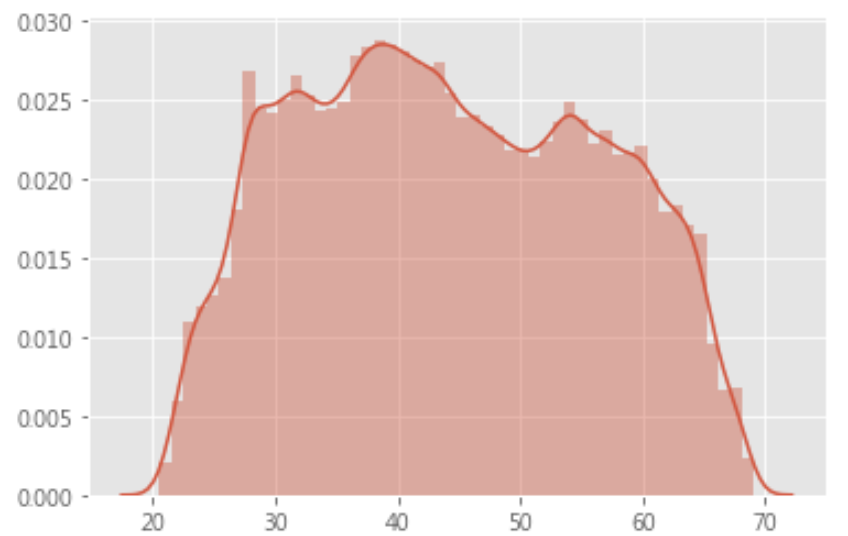
sns.distplot(df.loc[(df['TARGET'] == 0), 'YEARS_BIRTH']) |
|
1 2 3 4 5 6 7 8 9 10 11 12 |
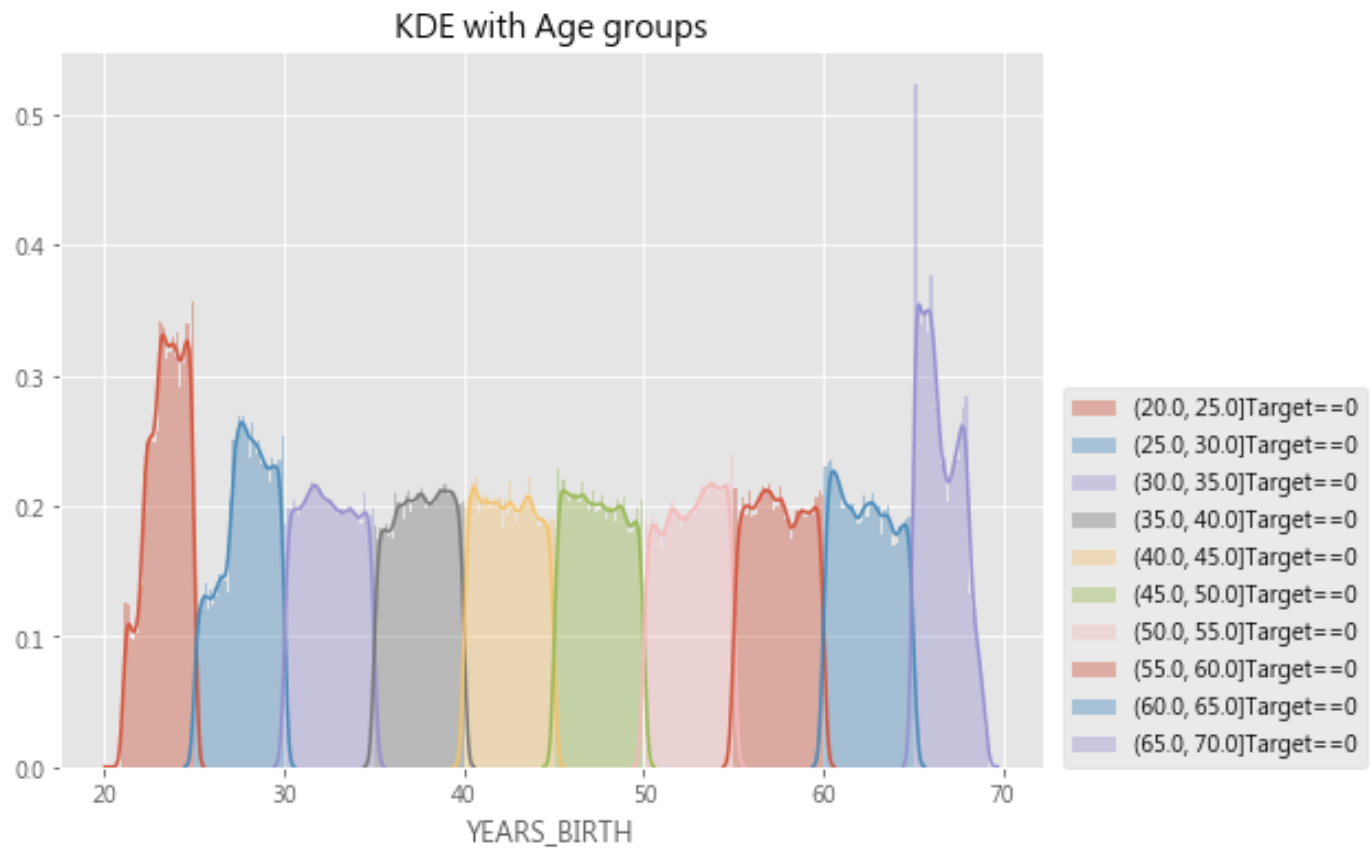
year_group_sorted = df.sort_values(by='YEARS_BINNED')['YEARS_BINNED'].unique() plt.figure(figsize=(8,6)) for i in range(len(year_group_sorted)): sns.distplot(df.loc[(df['YEARS_BINNED'] == year_group_sorted[i]) & (df['TARGET'] == 0), 'YEARS_BIRTH'], label = str(year_group_sorted[i]) + 'Target==0') # sns.distplot(df.loc[(df['YEARS_BINNED'] == year_group_sorted[i]) & \ # (df['TARGET'] == 1), 'YEARS_BIRTH'], label = str(year_group_sorted[i]) + 'Target==1') plt.title('KDE with Age groups') plt.legend(loc=(1.02, 0)) plt.show() |
九. plt.subplot :
|
1 2 3 4 5 6 7 8 9 10 11 12 |
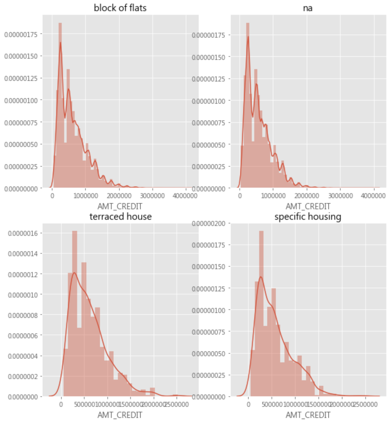
unique_house_type = df['HOUSETYPE_MODE'].unique() nrows = 5 ncols = 2 plt.figure(figsize=(10,30)) for i in range(len(unique_house_type)): plt.subplot(nrows, ncols, i+1) sns.distplot(df.loc[(df['HOUSETYPE_MODE'] == unique_house_type[i]) & (df['TARGET'] == 0), 'AMT_CREDIT'], label = "TARGET = 0", hist = True) plt.title(str(unique_house_type[i])) plt.show() |
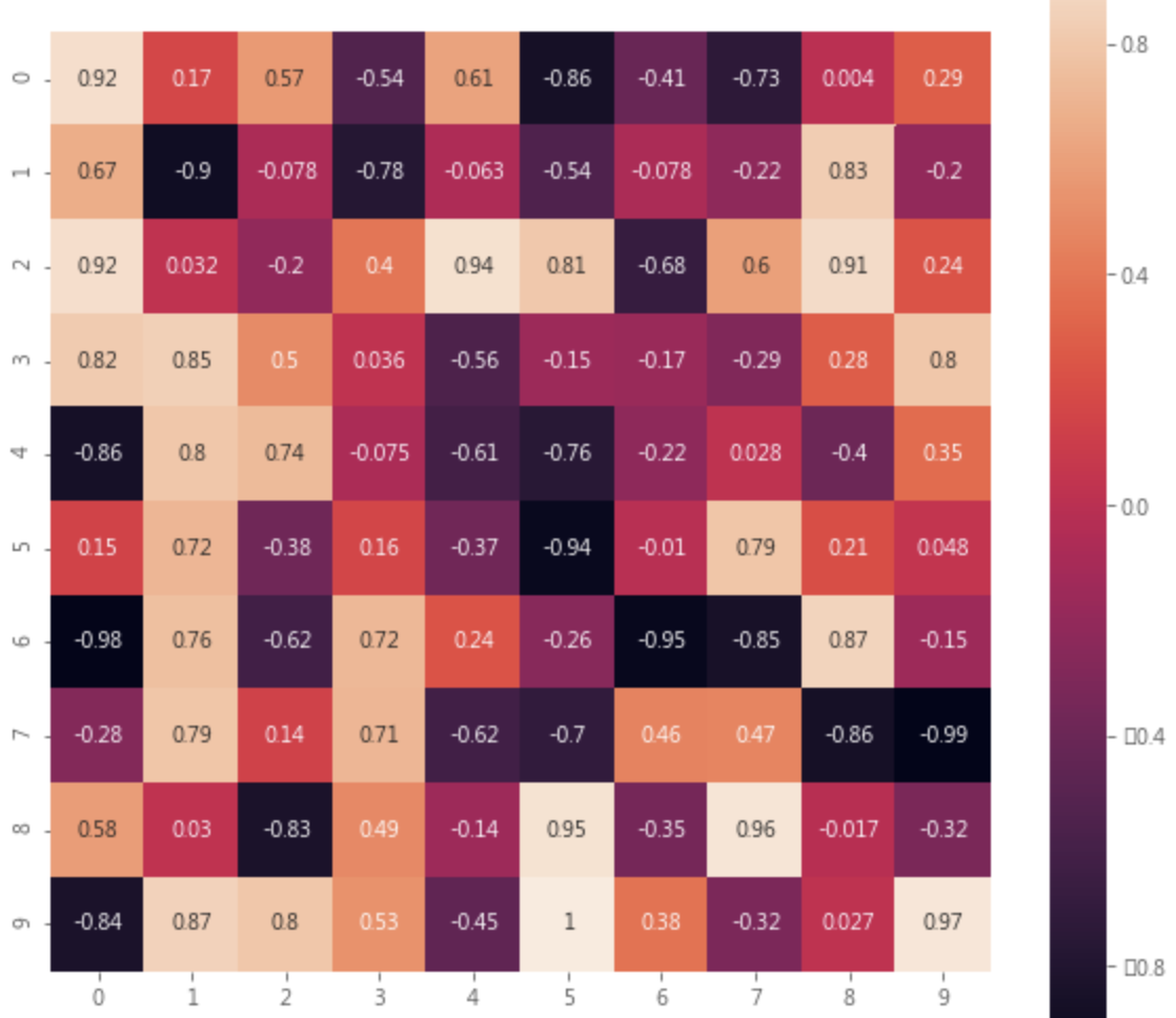
十. heatmap :
|
1 2 3 |
plt.figure(figsize=(10,10)) sns.heatmap(matrix.round(3),square=True,annot=True) plt.show() |
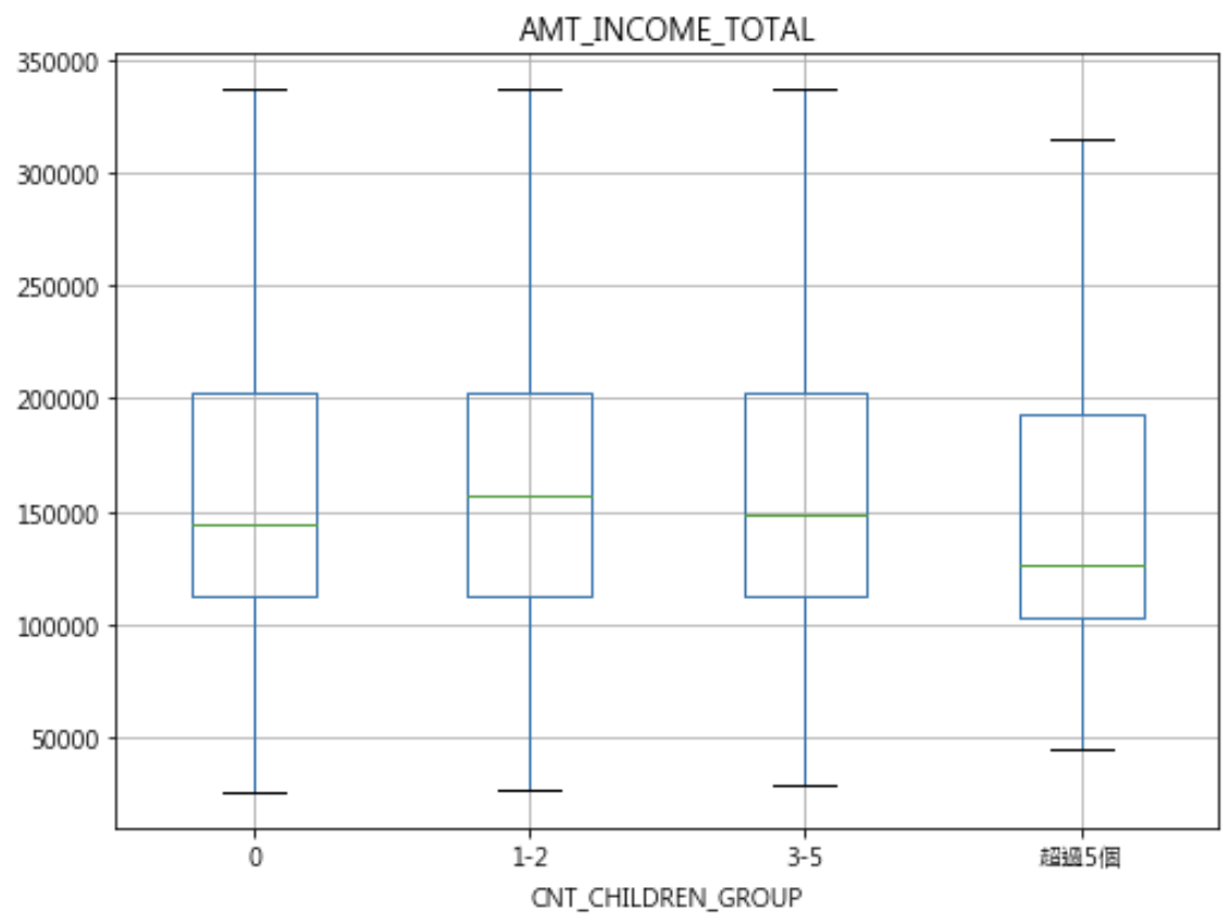
十一. df.boxplot :
|
1 2 3 4 5 6 7 8 9 10 11 12 13 14 15 16 17 18 19 20 21 22 |
import seaborn as sns # Groupy by + cut+ label cut_rule = [-1, 0, 2, 5, df['CNT_CHILDREN'].max()] labels = ['0','1-2','3-5','超過5個'] df['CNT_CHILDREN_GROUP'] = pd.cut(df['CNT_CHILDREN'].values, cut_rule, include_lowest=True, labels=labels) df['CNT_CHILDREN_GROUP'].value_counts() > 0 215371 > 1-2 87868 > 3-5 4230 > 超過5個 42 # df.boxplot() plt_column = 'AMT_INCOME_TOTAL' plt_by = 'CNT_CHILDREN_GROUP' df.boxplot(column=plt_column, by = plt_by, showfliers = False, figsize=(8, 6)) plt.suptitle('') plt.show() # df.boxplot() sns.boxplot(x='TARGET', y='EXT_SOURCE_3', data=df, width=0.4) |
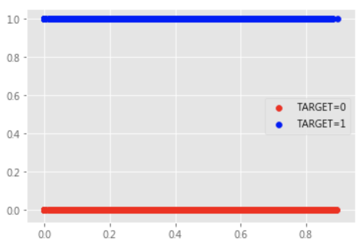
十二. plt.scatter :
|
1 2 3 4 5 6 7 |
plt.scatter( df[df['TARGET'] == 0]['EXT_SOURCE_3'], df[df['TARGET'] == 0]['TARGET'], marker='o', c='red', label='TARGET=0') plt.scatter( df[df['TARGET'] == 1]['EXT_SOURCE_3'], df[df['TARGET'] == 1]['TARGET'], marker='o', c='blue', label='TARGET=1') plt.legend() |
十三. df.plot:
|
1 2 3 4 5 6 7 8 9 10 11 12 13 14 15 16 |
DataFrame.plot(x=None, y=None, kind='line', ax=None, subplots=False, sharex=None, sharey=False, layout=None,figsize=None, use_index=True, title=None, grid=None, legend=True, style=None, logx=False, logy=False, loglog=False, xticks=None, yticks=None, xlim=None, ylim=None, rot=None, xerr=None,secondary_y=False, sort_columns=False, **kwds) # kind = 'str' # line : line plot #折線圖 # bar : vertical bar plot #長條圖 # barh : horizontal bar plot #橫向長條圖 # hist : histogram #柱狀圖 # box : boxplot #箱線圖 # pie : pie plot #圓餅圖 # scatter : scatter plot #散點圖 需要傳入columns方向的索引 >>>df.iloc[:,7:11].plot(x='AMT_INCOME_TOTAL',y='AMT_CREDIT',kind = 'scatter') |